Mac desktop applications have menus, many of which are generated for us automatically when we create a new application from the template. Sadly, they’re often overlooked and rarely documented in the courses I have looked at for Mac and SwiftUI. Here, we're going to put together enough information to show us how to:
- Remove unused built-in menu items.
- Rename an existing built-in item.
- Add pre-defined menu items for standard Mac functionality.
- Add new developer defined menu items.
Modifying Menu Items
Before we can get there, we need to change the app file to link our menu changes to the app itself. Menus can get a little messy from an organisation point of view, so we want to separate them out from the app entry point. That proves to be very easy.
@main
struct MenusAppApp: App {
    var body: some Scene {
        WindowGroup {
            ContentView()
        }

        .commands {
            Menus()
        }
    }
}
Menus are associated with a window group using the .commands modifier. The closure expects you to return one or more items of type Commands. We take advantage of this by creating a new struct, called Menus, that conforms to Commands:
import SwiftUI

struct Menus: Commands {
    var body: some Commands {
        EmptyCommands()
    }
}
EmptyCommands() is a built-in struct that contains no commands. It is useful here because it ensures that our Menus confirms to Commands without actually affecting our menu structure.
We now have enough structure to get us started. I would typically have a separate file for each menu that i am working on. These would be referenced from the Menus struct.
Removing a Menu Item
There are many built-in menus from the default application template. You won't find any explicit code for these, they just exist. So, what do you do when you want to remove one of them?
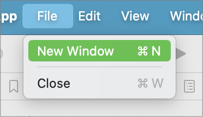
For this example, let's remove the New Window menu item from the File menu. You might want to do this if you want to handle opening files yourself.
By default, the File menu starts out with two items; New Window and Close:
We can remove this menu item by updating the Menus.swift file as follows:
struct Menus: Commands {
    var body: some Commands {
        CommandGroup(replacing: .newItem) {
            EmptyView()
        }
}
The CommandGroup struct is how we define a new or replacement menu item. Here we have specified the replacing parameter to indicate that we want to replace an existing menu. All menu items will have an identifier of type CommandGroupPlacement. For the help menu, this is called .newItem. This corresponds to the File->New Window menu item.
The handler for the menu item is specified as EmptyView() which returns an empty view. The menu system will recognise this and will remove the menu item.
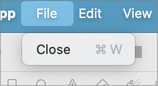
When we run this code, the File menu changes to remove the New Window item:
Replacing A Menu Item
There are many built-in menus from the default application template. You won't find any explicit code for these, they just exist. So, what do you do when you want to replace one of them?
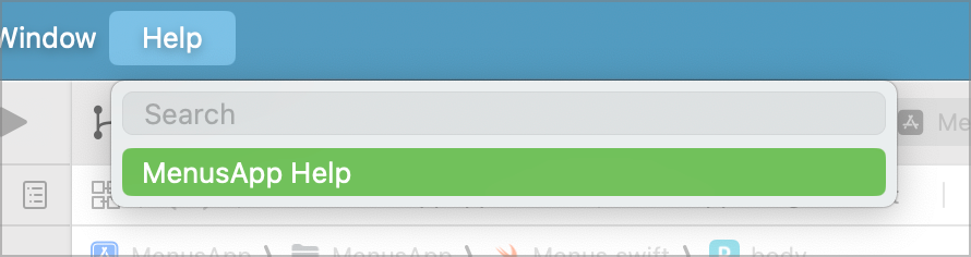
By way of example, let's replace the Help->Help menu. This is provided by default and displays a pretty useless dialog telling you that there is no help:
Lets update the Menus.swift file to override this:
struct Menus: Commands {
    var body: some Commands {
        CommandGroup(replacing: .newItem) {
            EmptyView()
        }

        CommandGroup(replacing: CommandGroupPlacement.help) {
            Button(action: {
                print("This is the help menu item")
            }, label: {
                Text("Application Help")
            })
        }
    }
}
As before, the CommandGroup struct is how we define a new or replacement menu item. Here we have specified the replacing parameter to indicate that we want to replace an existing menu. All menu items will have an identifier of type CommandGroupPlacement. For the help menu, this is called .help.
When we run this code, the previous menu is replaced with our new menu. Selecting the menu prints the message to the console.
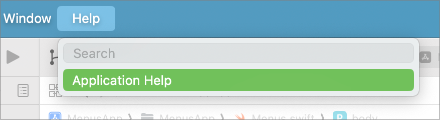
Note the changed caption.
Adding to Existing Menus
So far, we have removed or replaced menu items by using the replacing parameter to CommandGroup. It comes with two other options we can use when we want to add a new menu relative to an existing menu. These are
- CommandGroup(after:, addition:)
- CommandGroup(before:, addition:)
They add new menu items before or after an existing item in the menu structure.
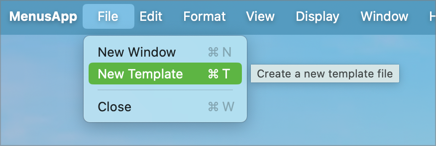
To illustrate this, let's add a new menu item after the File->New Window menu.
var body: some Commands {
    CommandGroup(after: .newItem) {
        Button(action: {
            print("New Template Selected")
        }, label: {
            Text("New Template")
        })
        .keyboardShortcut(KeyEquivalent("t"), modifiers: .command)
        .help("Create a new template file")
    }
Here we are adding a button after the New Window menu item. We've also embellished it by assigning a keyboard shortcut of <ctrl>tto give us quick access to the menu. Also, given this is a non-standard menu item, we have assigned some help text that will appear if the user hovers over the menu.
Predefined Menu Items
There are a number of pre-defined menus that provide us with additional menu items for free. These are coded in to the system for us to add if we need the specific functionality. There are five groups to pick from:
- SidebarCommands()
- ToolbarCommands()
- TextEditingCommands()
- TextFormattingCommands()
- EmptyCommands()
SidebarCommands adds a menu item to toggle the sidebar. We already have a toolbar icon for that and the menu item replicates that functionality for those of us who like menus.
ToolbarCommands adds menu items to toggle the toolbar on/off and to customise the toolbar if you have enabled that functionality. I have not covered that in this document, but you can google it.
TextEditingCommands adds menu items relating to text editing, such as find and spell check (there are many more).
TextFormattingCommands adds commands dealing with text formatting, such as fonts.
EmptyCommands is a special case that does absolutely nothing.
To use the commands, just add them to the menu definition. Our standard menu contains the default items:

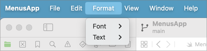
Let's update the menus.swift file to include the TextFormattingCommands().
struct Menus: Commands {
    var body: some Commands {
        CommandGroup(replacing: .newItem) {
            EmptyView()
        }

        CommandGroup(replacing: CommandGroupPlacement.help) {
            Button(action: {
                print("This is the help menu item")
            }, label: {
                Text("Application Help")
            })
        }

        TextFormattingCommands()
    }
}
Now, when we run the app, we will get a new Format menu with font and text attribute options. These will be applied to the active field of the active form at run time (assuming they are supported).
Adding Custom Menu Items
So far, we have dealt with modifying the supplied menu items. The real fun comes when we start adding our own menus. This is a little more complex, but gives us a great deal of flexibility.
Any new menu may have one or a dozen different items and sub-items, so we need a quick and easy way to create it. That’s where CommandMenu comes in to play. In the Menus.swift file, add the following:
struct Menus: Commands {
    var body: some Commands {
        // Previous code...
        TextFormattingCommands()

        CommandMenu("Display") {
            Button("Item 1") {
                print("Item 1 selected")
            }
            Button("Item 2") {
                print("Item 2 selected")
            }
            Divider()
            Button("Item 3") {
                print("Item 3 selected")
            }
        }
    }
}
When we run our application, we now see a new menu called Display with options in it.
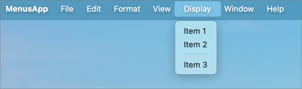
CommandMenu is creating the top level menu and each of the Buttons create the menu items. I have also included a Divider() to illustrate grouping items together.
Adding a Toggle
We are not restricted to just buttons in our new menus. What if we want a toggle switch; perhaps something that corresponds to a system setting.
Update the Menu.swift file to add an app setting to the top. We'll be toggling this in our menu.
struct Menus: Commands {

    @AppStorage("setting1") var toggle1: Bool = true

    var body: some Commands {
    }
Next, add a Toggle to the end of the Display menu.
CommandMenu("Display") {
    Button("Item 1") {
        print("Item 1 selected")
    }
    Button("Item 2") {
        print("Item 2 selected")
    }
    Divider()
    Button("Item 3") {
        print("Item 3 selected")
    }

    Divider()
    Toggle(isOn: $toggle1) {
        Text("Setting 1")
    }
}
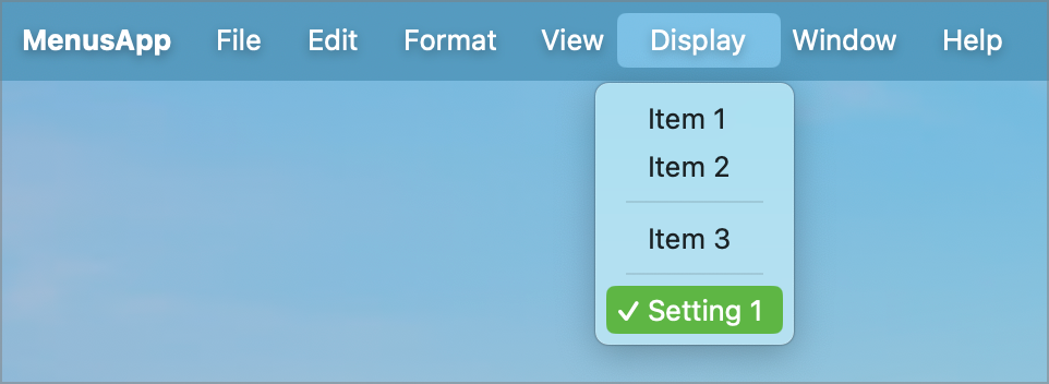
This creates a toggle switch on the Display menu. The caption will be Setting1. As it is tied to the AppStorage setting we created, it will retain the state of that setting and will display a check mark when set.
Adding a Picker
Quite often options are defined by Enum's. When this is the case, and we want to be able to change the current setting via a menu, we need to implement a picker. Ok, this is easier to illustrate by showing the code!
For our Enum, we'll define a display mode enum.
import SwiftUI

enum DisplayMode: String, Identifiable, CaseIterable, Equatable {
    case light
    case dark
    case auto

    var id: String {
        return self.description
    }

    var description: String {
        switch self {
        case .light:
            return "Light"
        case .dark:
            return "Dark"
        case .auto:
            return "Auto"
        }
    }
}
It's a simple Enum with a few protocols.
- Identifiable is required to be able to identify the options. The id we use is the text description of the enum value.
- CaseIterable is required so we can loop over all the options. We will use this when constructing the menu.
- Equatable is required so we can compare enum values.
Now that we have this, we can add an AppStorage setting to the top of our Menus.swift file.
struct Menus: Commands {

    @AppStorage("setting1") var toggle1: Bool = true
    @AppStorage("displayMode") var displayMode: DisplayMode = .light

    var body: some Commands {
    }
Finally, we need to add our Picker to the Display menu.
CommandMenu("Display") {
    Button("Item 1") {
        print("Item 1 selected")
    }
    Button("Item 2") {
        print("Item 2 selected")
    }
    Divider()
    Button("Item 3") {
        print("Item 3 selected")
    }

    Divider()
    Toggle(isOn: $toggle1) {
        Text("Setting 1")
    }

    Divider()
    Picker(selection: $displayMode, content: {
        ForEach(DisplayMode.allCases) { mode in
            Text(mode.description).tag(mode)
        }
    }, label: {
        Text("Display mode")
    })
}
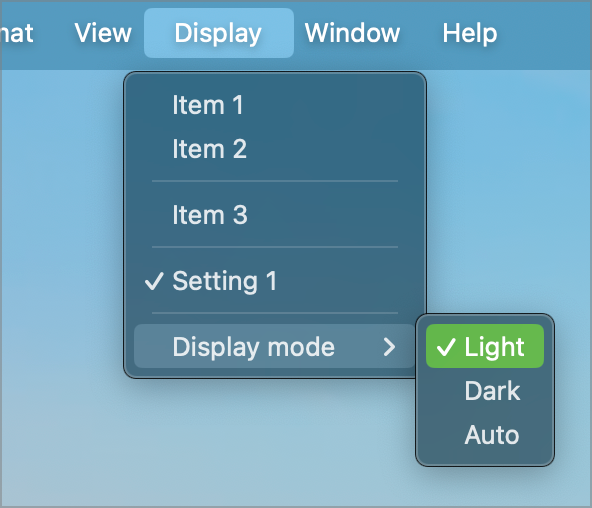
The Picker is bound to the setting we just added, so will reflect the last set value and will update the AppSettings when a new option is selected. When we run this code, we get a new menu option called Display Mode on the end of the Display menu. It has sub-options for each of the items in the DisplayMode enum.
Adding a Sub-Menu
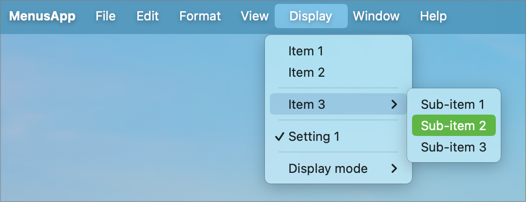
So far, we have created single level menus. Our Display menu has three menu items labelled Item 1, Item 2 and Item 3. What happens, however, if Item3 has sub-options that we want to appear on the menu. We can't use a Picker for these as they are all separate items. What we need is a sub-menu.
Fortunately, this is relatively trivial. In our current definition, Item 3 is defined as a Button. There is no reason why it can't be another Menu.
CommandMenu("Display") {
    Button("Item 1") {
        print("Item 1 selected")
    }
    Button("Item 2") {
        print("Item 2 selected")
    }
    Divider()
    Menu("Item 3") {
        Button("Sub-item 1") {
            print("Sub-item 1 selected")
        }
        Button("Sub-item 2") {
            print("Sub-item 2 selected")
        }
        Button("Sub-item 3") {
            print("Sub-item 3 selected")
        }
    }
}
Item 3 now expands into a sub-menu containing three items.