Very few applications don’t have some kind of user settings. Little tweaks that make the application more customisable by the user. They are what makes an application more flexible and, by implication, more likely to be adopted by a wider audience. When you create a blank MacOS project, you will see that there is no settings menu item provided by default. While the templates give you a lot, we're on our own when it comes to settings. Not too unreasonable as the template designers couldn't be expected to know what settings you require.
To create settings, we're going to need to do several things;
- Create the Settings menu item.
- Create a settings window.
- Categorise our settings into related groups.
- Create some way to save and restore our settings.
- Provide individual settings views for those categories.
The settings Menu
Getting a setting option to appear in the application menu is frighteningly simple. We need to add the Settings scene to the application definition. We don't even need to create a view to make it work, though it is useless without it!
import SwiftUI

@main
struct settingsAppApp: App {
    var body: some Scene {
        WindowGroup {
            ContentView()
        }

        Settings {

        }
    }
}
Running the app with this gives us the settings option on the application menu.
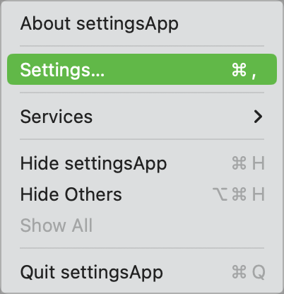
It comes with the <cmd>, shortcut by default and, when selected, will popup a default, empty window.
Create A Settings Window
The default window serves no purpose at all. We can't modify it and it provides no functionality. It's only there to prevent the app from crashing, so we need to create a starter view. Given that, at this stage, we do not know what our settings will be, it makes sense to create a place-holder view that will give us the structure of the view without any usable content.
To do this, we can create a view, notionally called SettingsView, and add this content.
import SwiftUI

struct SettingsView: View {
    var body: some View {
        TabView {
            Text("General")
                .tabItem {
                    Label("General", systemImage: "gearshape")
                }

            Text("Set 1")
                .tabItem {
                    Label("One", systemImage: "square.and.arrow.up")
                }

            Text("Set 3")
                .tabItem {
                    Label("Advanced", systemImage: "gearshape.2")
                }
        }
        .frame(minWidth: 460)
    }
}
A typical settings view consists of a TabView where each tab corresponds to a group of options. For the sake of placeholders, we are using Text views. The Label view determines what the user sees for each tab.
It's worth noting that what you see in the preview will not be correct; the icons will not be displayed. In the view we see on-screen, the icons will be present.
To get our settings view displayed, we need to change the Settings scene to name our view:
        Settings {
            SettingsView()
        }
When we run the code and select the settings menu, we now get a placeholder window that we can work with.
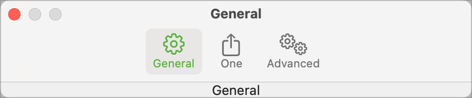
For each tab we defined in the TabView we get a tab in the settings view. The content of each tab is the text from the Text view.
Categorise Our Settings
How you categorise your settings is entirely dependant on how the application is structured. I would highly recommend that you note down the options you want to provide your user with, group them together and create a view for each set of options. By way of example, I plan on creating three settings groups:
General
- A count of the recent files to track.
- A day count to use in dated filters.
- The display mode (light/dark/automatic).
Export
- The export format.
- The content to export (single/multiple).
- Tick box to open the exported file.
- Tick box to open the folder we exported to in Finder.
Advanced
- Option to close the app when the last window is closed.
Once we have a rough idea of the settings we want to start out with, we need to decide how to store them.
Storing Our Settings
Settings are typically saved to UserSettings. This is a good place to save small amounts of data and SwiftUI provides an extremely simple mechanism for reading and writing UserSettings using @AppStorage. To simplify the view code, we define our settings in a view model:
class SettingsViewModel: ObservableObject {

    // General tab options
    @AppStorage("displayMode") var displayMode: DisplayMode = .auto
    @AppStorage("recentFileCount") var recentFileCount: Int = 5
    @AppStorage("durationForRecentFilters") var recentFileFilters: Int = 5

    // Export settings
    @AppStorage("exportOpenInFinder") var exportOpenInFinder: Bool = true
    @AppStorage("exportOpenFile") var exportOpenFile: Bool = false
    @AppStorage("exportDefaultFormat") var exportDefaultFormat: ExportFormat = .html
    @AppStorage("exportDefaultContent") var exportDefaultContent: ExportContent = .single

    // Advanced Settings extra options
    @AppStorage("closeAppWhenLastWindowCloses") var closeAppWhenLastWindowCloses: Bool = true
}
Note; I have hard coded the names of the values. Convention dictates that, in a real application, these would be constants so we ensure consistency of spelling through the application. This is sample code, so I'm trying not to over-complicate the code with additional files.
I have used three enums in these settings; DisplayMode, ExportFormat, ExportContent. These are simple enums;
enum DisplayMode: String, Identifiable, CaseIterable, Equatable, CustomStringConvertible {
    case light
    case dark
    case auto

    var id: String {
        return self.description
    }

    var description: String {
        switch self {
        case .light:
            return "Light"
        case .dark:
            return "Dark"
        case .auto:
            return "Auto"
        }
    }
}
enum ExportFormat: String, CaseIterable, Identifiable, CustomStringConvertible {
    case html
    case xml
    case json

    var id: String { self.description }

    var description: String {
        switch self {
        case .html:
            return "HTML"
        case .xml:
            return "XML"
        case .json:
            return "JSON"
        }
    }
}
enum ExportContent: String, CaseIterable, Identifiable, CustomStringConvertible {
    case single
    case leg

    var id: String { self.description }

    var description: String {
        switch self {
        case .single:
            return "Current Item"
        case .leg:
            return "Current Item and Children"
        }
    }
}
Because we want to use these in our settings, we need to provide descriptions of the options and we need to be able to iterate over the available options, so each enum has to implement CustomStringIdentifiable and CaseIterable. We also implement Identifiable to give our values an id that can be stored.
Individual Settings Views
Now we have a view model, we can extend our settings view to use the view model and to replace the Text views with settings specific views.
struct SettingsView: View {

    @StateObject private var settings = SettingsViewModel()

    var body: some View {
        TabView {
            GeneralSettings(settings: settings)
                .tabItem {
                    Label("General", systemImage: "gearshape")
                }

            ExportSettings(settings: settings)
                .tabItem {
                    Label("Export", systemImage: "square.and.arrow.up")
                }

            AdvancedSettings(settings: settings)
                .tabItem {
                    Label("Advanced", systemImage: "gearshape.2")
                }
        }
        .frame(minWidth: 460)
    }
}
This is where the fun begins. We need to implement the three views that manipulate our settings.
General Settings
We have determined that we need three settings in the general setting grouping:
- A count of the recent files to track.
- A day count to use in dated filters.
- The display mode (light/dark/automatic).
The first two are counters where we want to control the available range and the third is a selection list with a limited number of options. We can achieve this using a couple of Stepper's and a Picker.
struct GeneralSettings: View {

    @ObservedObject var settings: SettingsViewModel

    var body: some View {
        Form {
            HStack {
                Stepper("Recent Files to Keep",
                    value: $settings.recentFileCount,
                    in: 4...15,
                    step: 1
                )
                Text("\(settings.recentFileCount.formatted()) files")
            }
            .padding(.bottom, 12)

            HStack {
                Stepper("Days to use in recent filters",
                        value: $settings.recentFileFilters,
                    in: 1...30,
                    step: 1
                )
                Text("\(settings.recentFileFilters.formatted()) days")
            }
            .padding(.bottom, 12)

            Picker("Display mode", selection: $settings.displayMode) {
                ForEach(DisplayMode.allCases) { mode in
                    Text(mode.description).tag(mode)
                }
            }
        }
        .padding()
    }
}
First thing to note here is that the input views are all contained within a Form. This might seem a little redundant, but containing everything in a form lets the form deal with a lot of the layout for us. It will, for many input views, correctly line up labels and input fields.
Sadly, the Stepper() is not one of those views that Form handles well, so we have put it into an HStack to achieve the layout we want. We also have a spacing problem between input fields, so there is a bottom padding between input fields.
Each Stepper has its own range defined. The Form will properly align the stepper, but we also want to have the current value and descriptive text, so we need the HStack to get all this information on one line. The picker gets its possible values from the DisplayMode enum we defined earlier. All values are read from and written to the SettingsViewModel we were passed in.
The resulting settings window is:
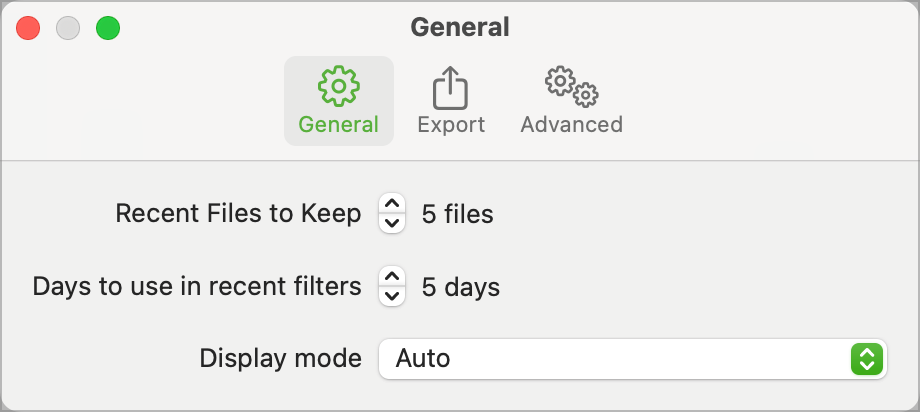
The resulting window will be sized to fit the content on the General tab. This is done automatically and will vary for each tab.
Export Settings
The export tab is required to collect four values;
- The export format.
- The content to export (single/multiple).
- Tick box to open the exported file.
- Tick box to open the folder we exported to in Finder.
The export format and content are enums we defined earlier. The two tick boxes are toggles.
struct ExportSettings: View {

    @ObservedObject var settings: SettingsViewModel

    var body: some View {
        Form {
            Picker("Default Format", selection: $settings.exportDefaultFormat, content: {
                ForEach(ExportFormat.allCases) { format in
                    Text(format.description).tag(format)
                }
            })

            Picker("Default Content", selection: $settings.exportDefaultContent, content: {
                ForEach(ExportContent.allCases) { content in
                    Text(content.description).tag(content)
                }
            })

            Toggle(isOn: $settings.exportOpenFile,
                   label: { Text("Open file with default application.")})

            Toggle(isOn: $settings.exportOpenInFinder,
                   label: { Text("Open export folder in Finder.")})
        }
        .padding()
    }
}
As with the general settings, everything is encapsulated in a Form. We don't need the HStack's we used previously because the Form knows how to correctly format these input views. It also knows how to correctly space them, so the padding isn't required.
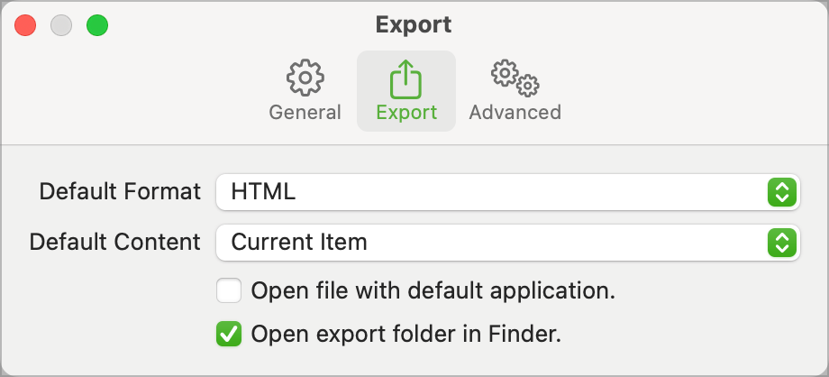
The Form has correctly aligned all the input fields for us.
Advanced Settings
The final tab contains a single option.
- Option to close the app when the last window is closed.
It will be a simple toggle switch.
struct AdvancedSettings: View {

    @ObservedObject var settings: SettingsViewModel

    var body: some View {
        Form {
            Toggle(isOn: $settings.closeAppWhenLastWindowCloses,
                   label: { Text("Close the app when the last window closes.")})
        }
        .padding()
    }
}
When the advanced tab is selected, this is the only. option displayed.
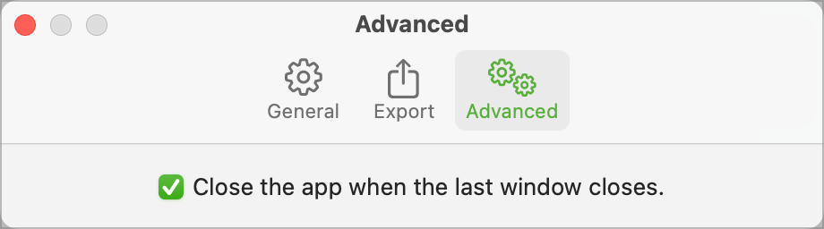
As with the other settings tabs, the window automatically resized to fit the content.
Conclusion
For the majority of your settings, a simple form is going to do most of the heavy lifting. You are not, however, required to use a form where your requirements are a little more complex. By way of an example, I have a settings tab in one of my apps that allows me to customise the fonts:
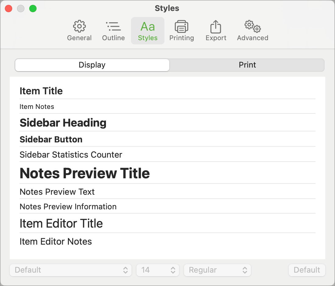
The app has display and print customisations, so we have a segmented control at the top of the tab. We have a list in the middle and a font selection control at the bottom. When the print segment is selected, the list changes to print fonts:
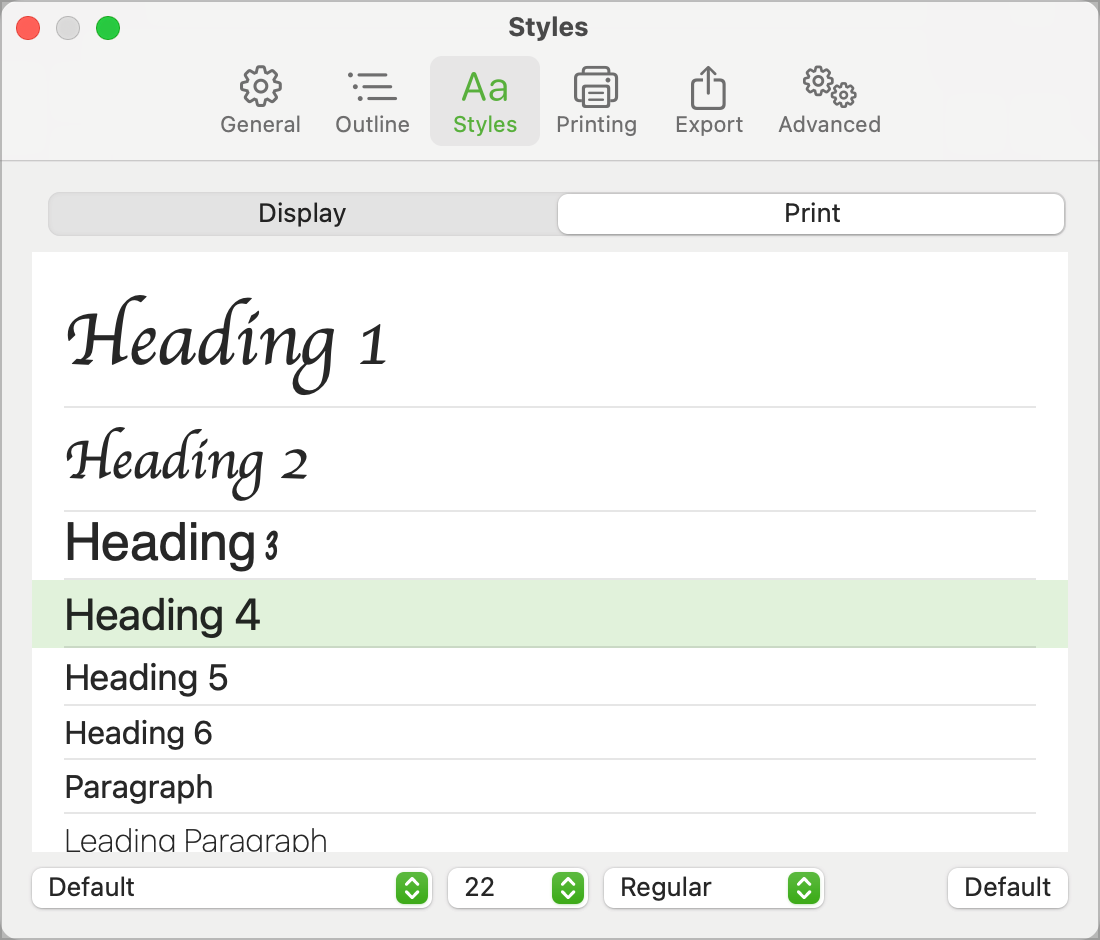
This is a considerably more complex settings panel for which a Form is inappropriate. The principles, however, are the same as for all the other settings views. The settings window is going to resize itself to fit the contents. In this case, the segmented control and the font selection control have a fixed size, so the height of the tab is set by changing the height of the list.
Get The Code